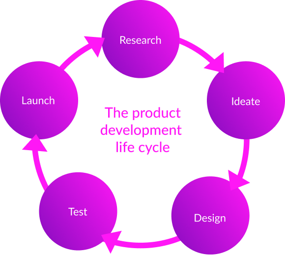
Bikes Generation

E-commerce website selling bicycles to amateurs and professionals cycling
My role.

UX/UI Design, UX Researcher,
Prototyping, Usability Testing

Project Duration

80 hours
June 6 - July 4 2022

Tools used.

Figma, Photoshop, Google, Exell, Zoom

Project overview

Bike Generation Company sells bikes on their website experience. The company needs to improve its product’s usability, browsing, and the checkout experience
Business Goal:

Improve the conversion from browse to completion of checkout to increase revenue on the product’s mobile-web experience

Important information

Product Manager has shared data that shows 50% of users open on average 7 item pages and then abandon the site without moving any items into the cart. Product Manager hypothesis is that users are unable to determine wich bike is best based on relative features.

Additionally, 70% of users who place an item in the cart do not purchase i. Data shows that users abandon the cart at the registration page. Right now, users must make an account to purchase.

The Process

Design process

In order to achieve the set goals, I decided to study our target audience and successful competitors of our company. Identify and study the most successful competitors in the bicycle sales sector and their user checkout flow.

Research

To achieve the set goals, I decided to study our target audience and successful competitors of our company. Identify and analyze the most successful competitors in the bicycle sales sector and their user checkout flow. I also used the internet, social media, and friends to further explore the competitors and target audience.

Research stages:

- Identify 3 of the most successful competitors in the bicycle sales sector.
- Identify the user journey from finding a bike to completing a purchase by successful competitors.
- Make a visual comparison.

Research methods:

- Review and search for the necessary information on the internet
- Competitors analysis

Competitor audit

Ideate

Based on my research and Product Manager information I created Mike as my User Persona. Representing my targeted audience's motivations, frustrations, need, and goals during the completion of the task.

User Persona
Based on the Competitive analysis, I create CJM for each competitor
CJM
CJM
CJM
User flow

Design

I designed the Low-fidelity wireframes based on conducted research to see how the information would be laid out on each screen. I used my combined research findings and persona to guide my design, ensuring the business needs were met before moving into the next phase of the process.

To improve the conversion from viewing to placing an order on the site, I added customer reviews about the store on the home page. For this purpose, I also added reviews on the bike page and the possibility to compare some early chosen bikes.

To slightly influence buyers' emotions when they choose bicycles, I added such design elements to the store page as a best seller badge and star rating.

To reduce the time for buyers to checkout, I added the ability to pay as a guest.  I also added the free return option to encourage them to leave their email.

low fidelity design 1
LF design 2
LF store page
low fidelity design 1
LF design 2
LF store page
LF store page
A quick guerrilla test of the Low fidelity design showed that users generally appreciated the design. In this quick test session, I wanted to find out how intuitive the design is and how easy for users to navigate from finding the right item to purchase. Two interviews were conducted in person and one remotely. Each interview lasted about 30 minutes. All participants completed the task.
Two out of three participants would like to add the ability to select bikes using filters such as Brand, Price, Frame material, Color, and Size.

High Fidelity Design

Style guide

Putting together the results of my research and first quick test, I created a High Fidelity Design forBike Store website

low fidelity design 1
LF design 2
LF store page
low fidelity design 1
LF design 2
LF store page
LF store page

Test

For the next Bike Generation user testing sessions, I Interviewed five people that fit into the app's target audience. Before diving into the testing process, I introduced myself and got to know the users. I wanted to find out how intuitive the design is and how easy for users to navigate from finding the right item to purchase. Two interviews were conducted in person and one remotely. Each interview lasted about 30 minutes.

Participants were asked:

- Does anything attract your interest on the home page?
- Where would you go first on this site?
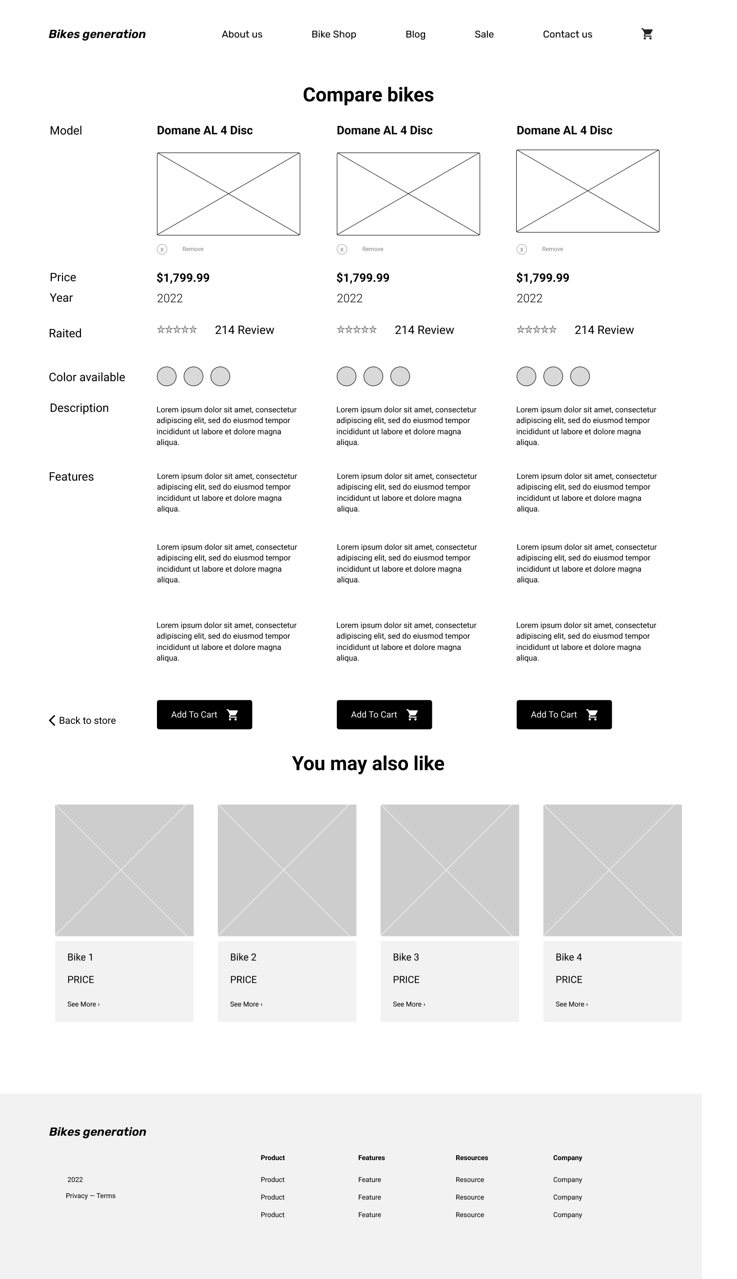
- Look through the different products the site has and identify 1- that you like.
- Now narrow down your choice to the one you’d be most likely to purchase. Why did you pick this one?
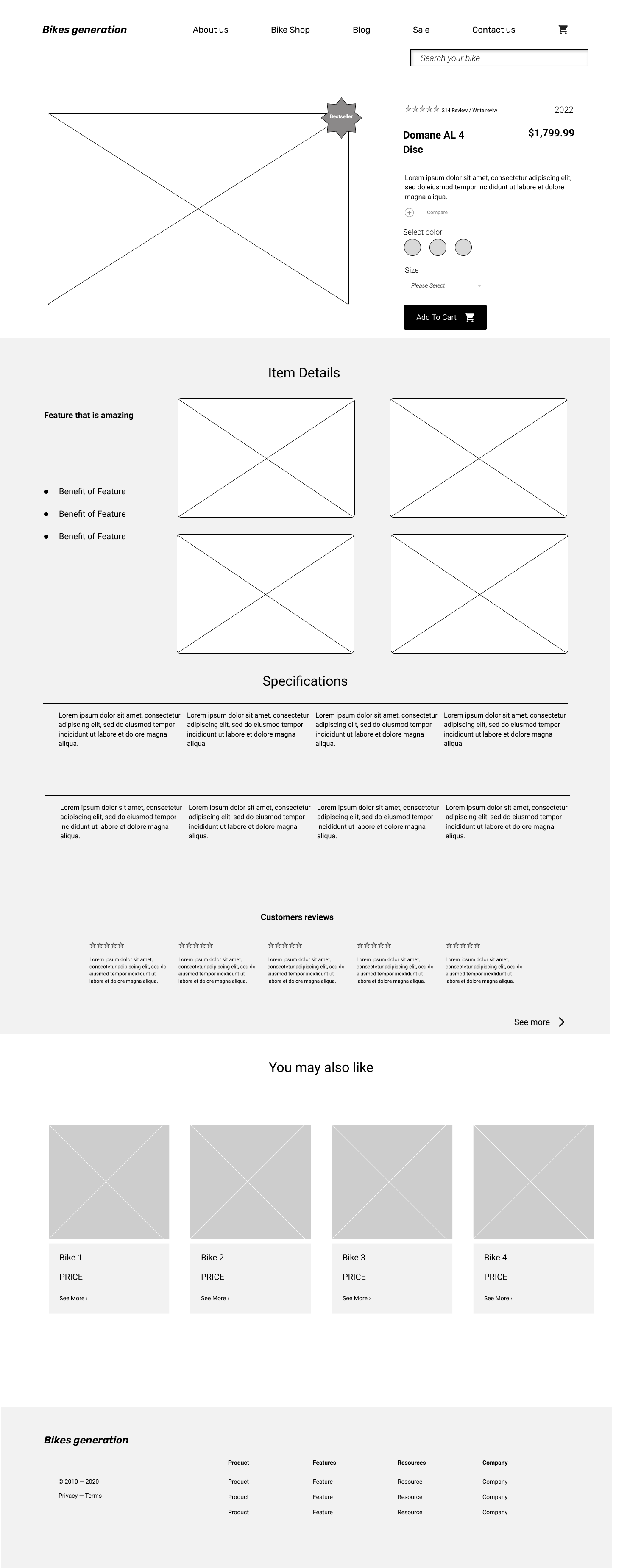
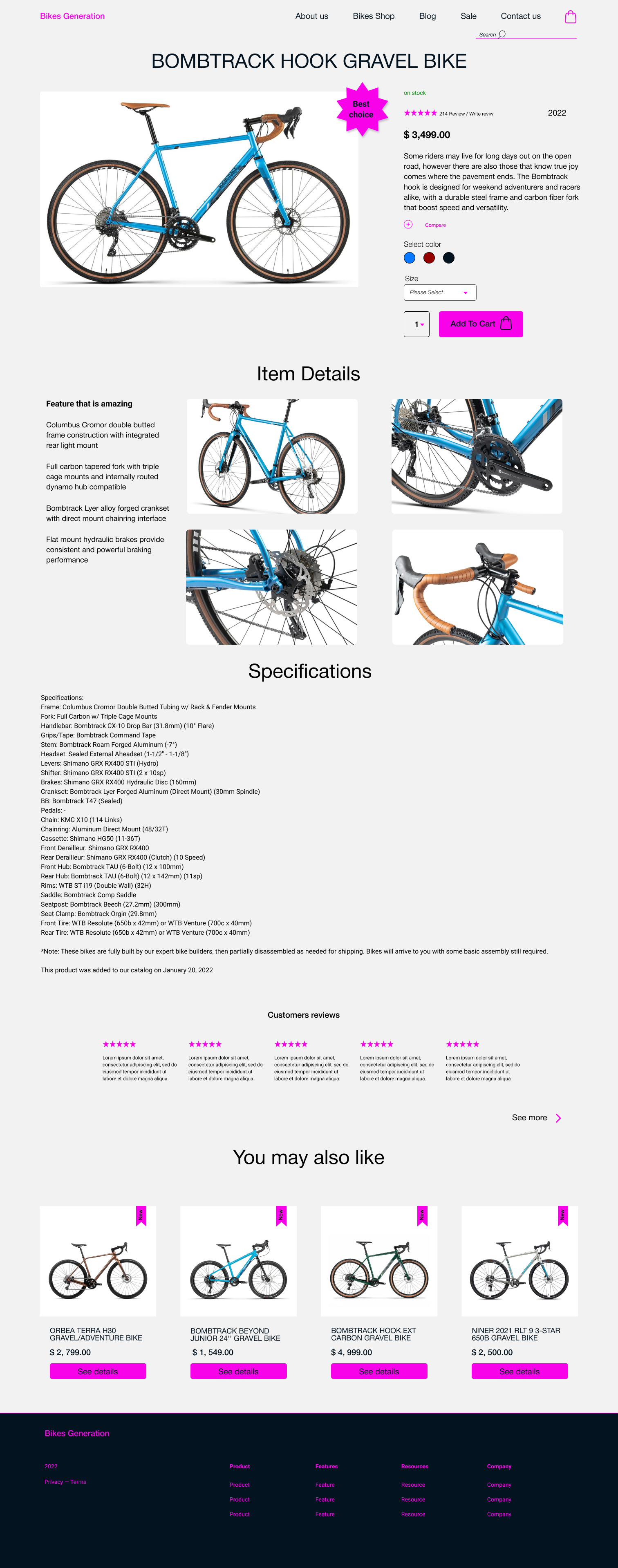
- What are your thoughts on the product pages?
- If you haven't already, talk a little bit about what you see here. Is there anything you don’t understand, or any information you can’t find?
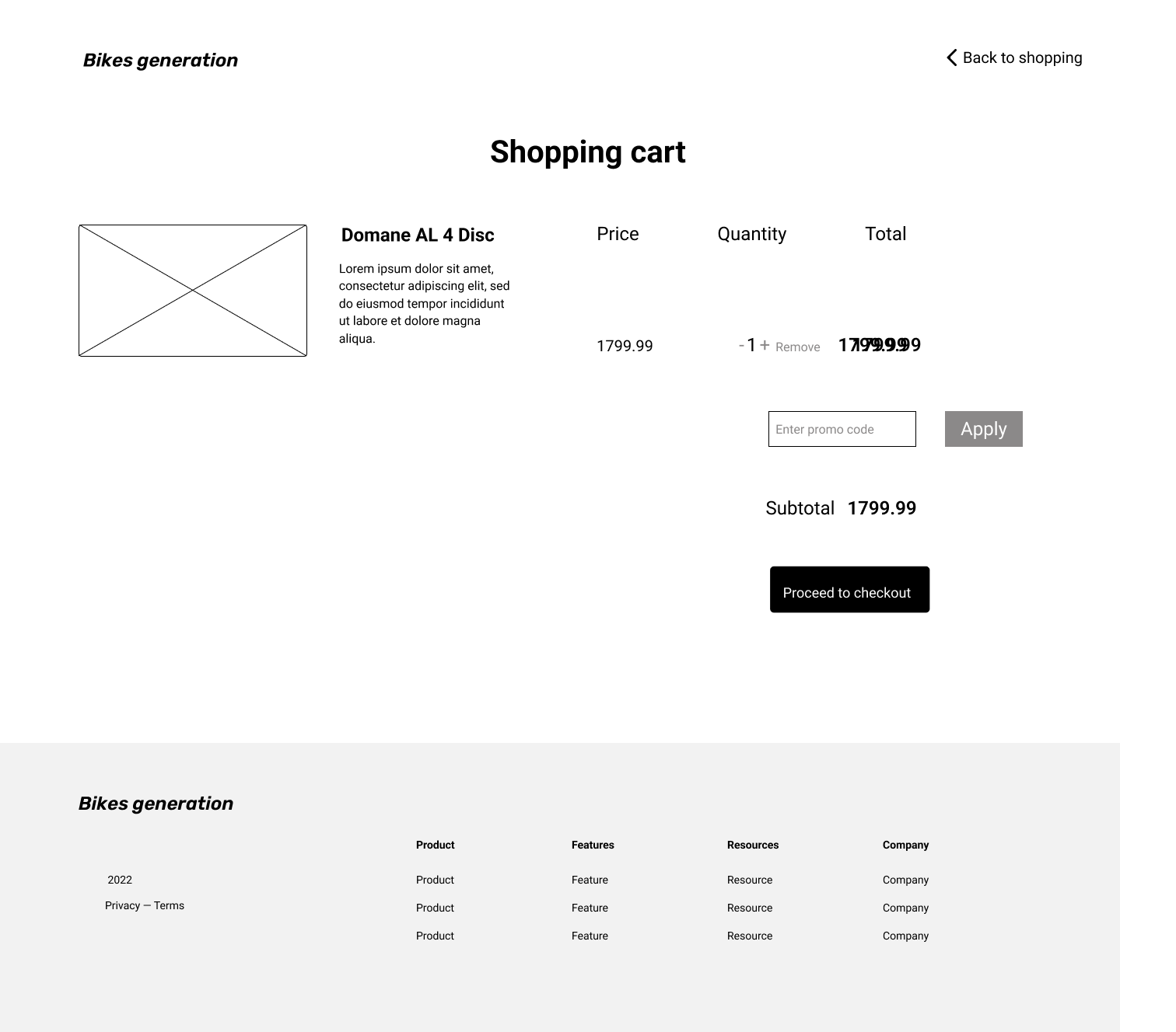
- Customize the size, color, and any other options for the product you’ve chosen, and then add it to your cart.
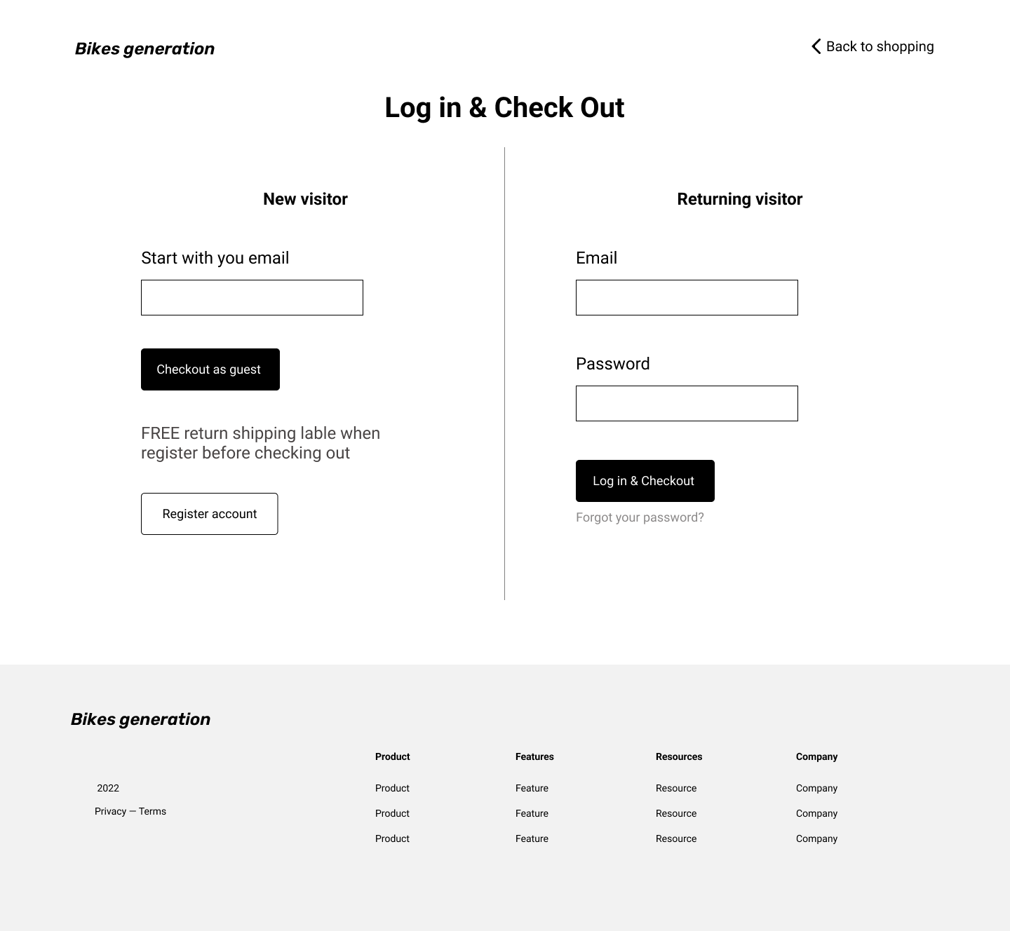
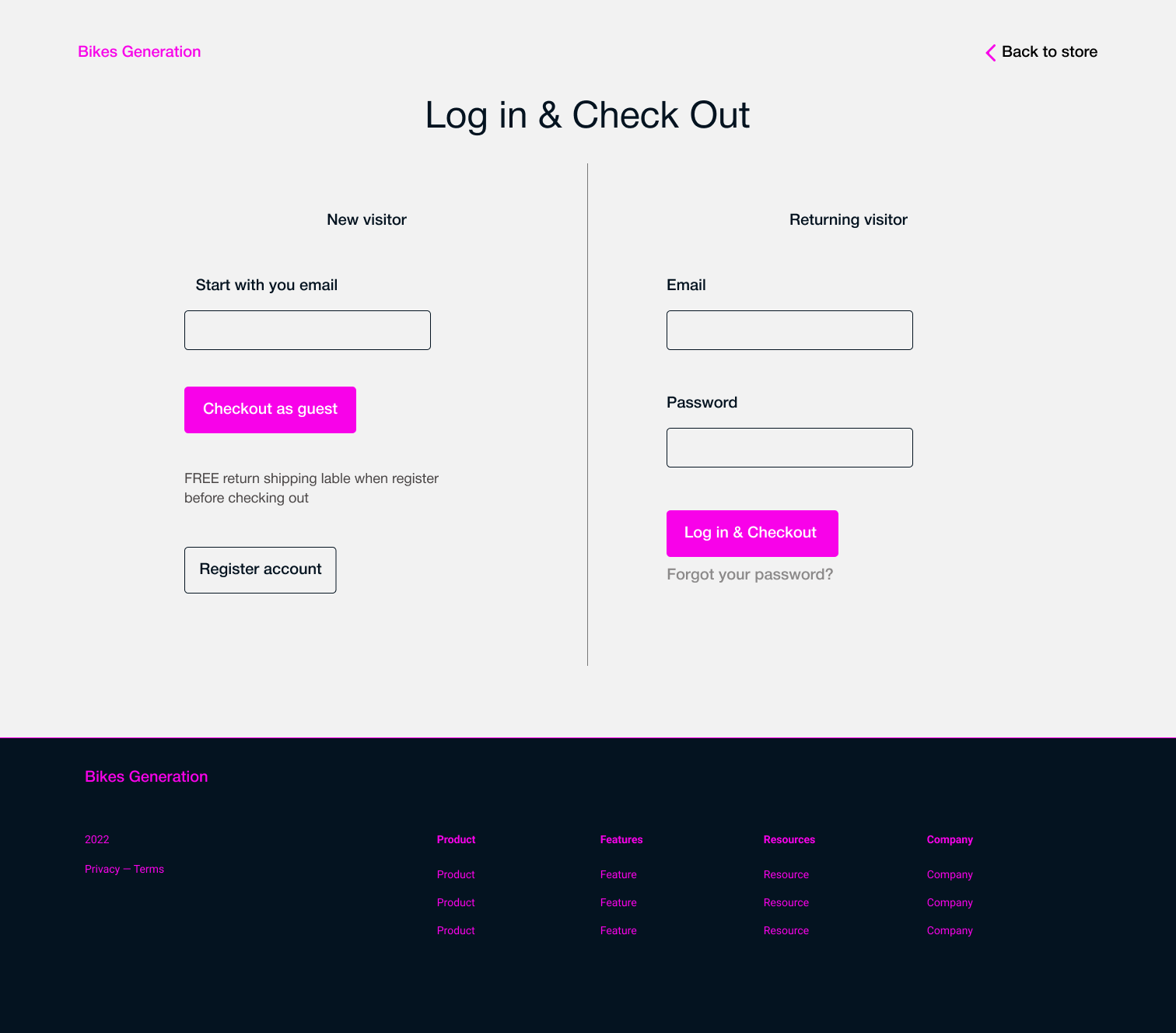
-  Proceed with the checkout process, all the way up until the log-in and check-out page.
- At this point, how likely or unlikely would you be to make a purchase on this website?
- Do you trust the site? Why or why not?

Key Findings:

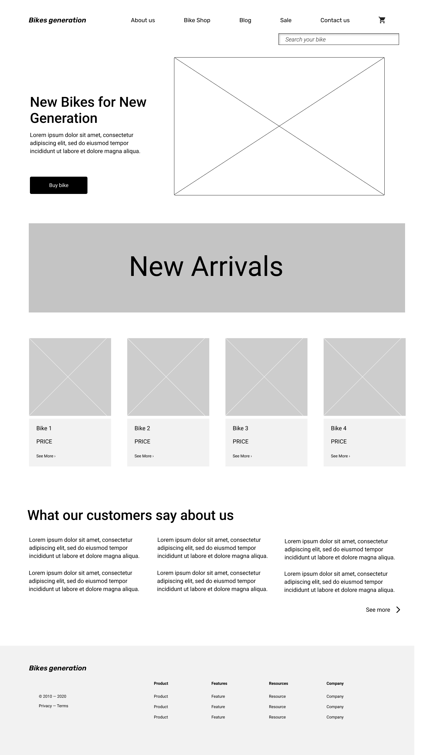
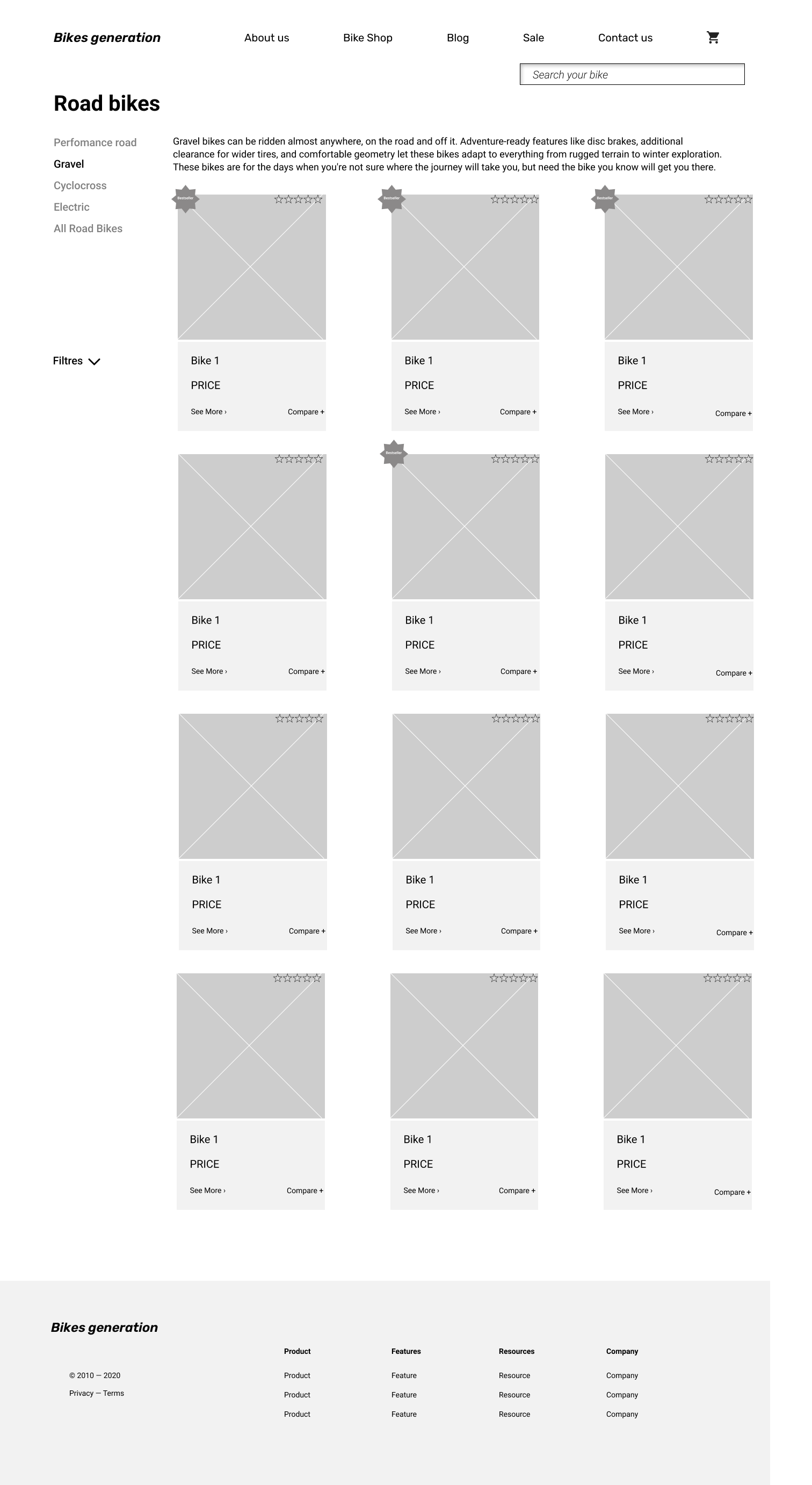
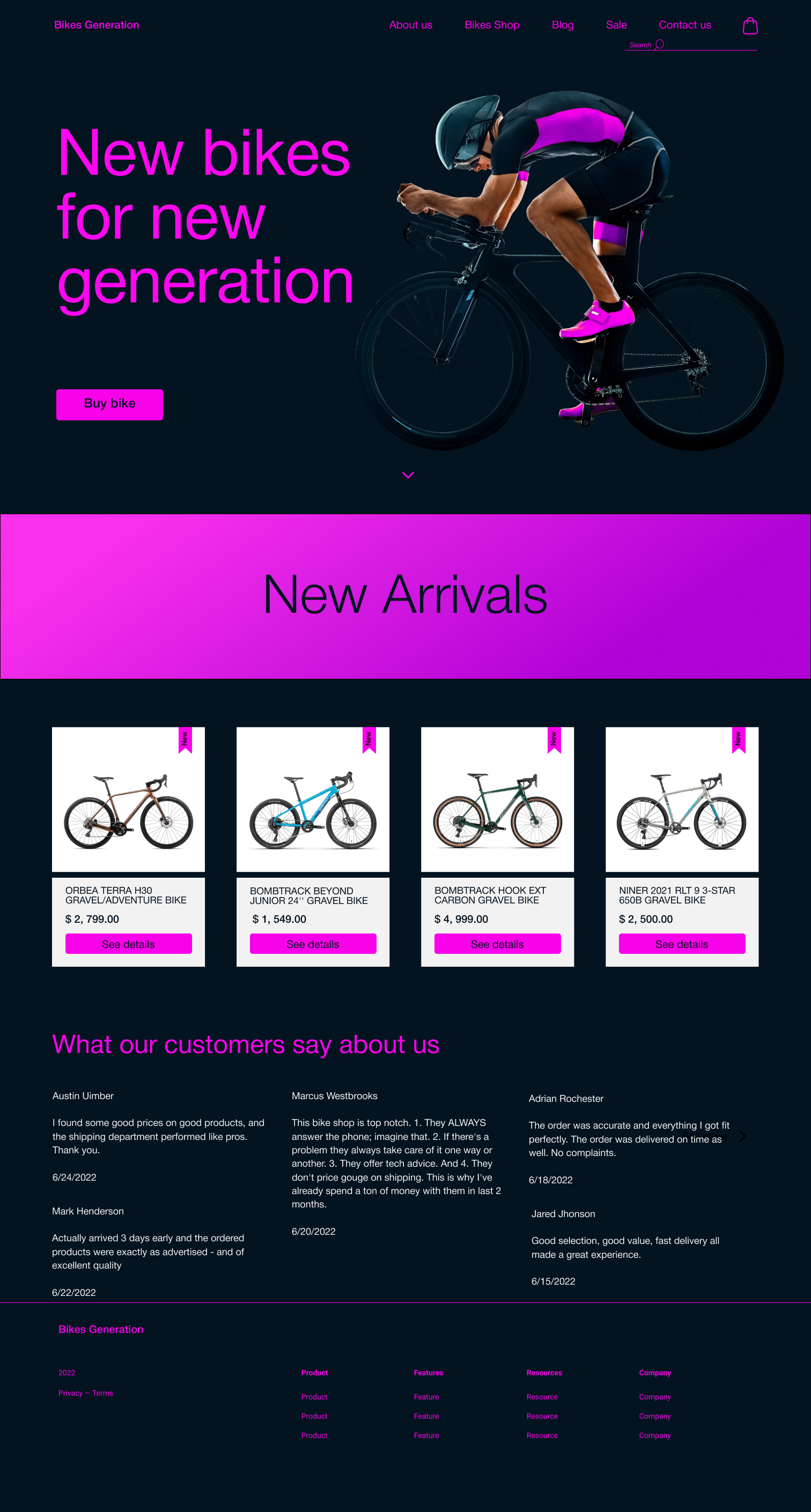
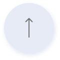
All participants successfully went from landing on the site to the check-out page. But four of five participants didn't scroll the first page to see new arrivals' bicycles; they just pushed the CTA button and opened the store page.

To encourage users to scroll the page to see new arrivals of bikes and customer reviews, I decided to add a small accent arrow pointing down on the first screen.

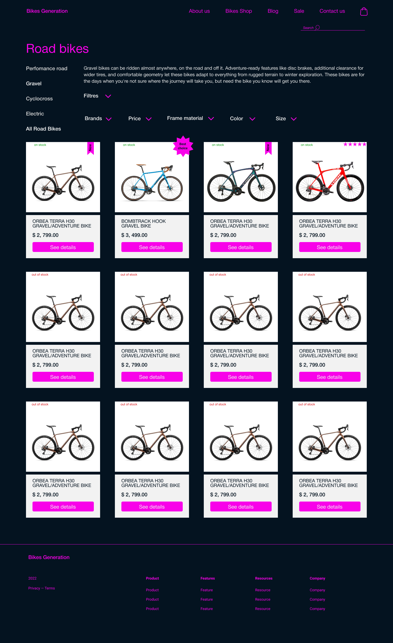
Three out of five participants would like to see the relevance of the availability of bicycles for sale. According to their previous experience, the selected bike is often out of stock when it comes to buying. So I decided to add this information to the page with items.

Three out of five participants would like to have the possibility to cancel the order at the end, so I decided to add the cancel button but make it not very notable.

Conclusions on the project

I really enjoyed this project.  I worked not only on solving user problems and improving their quality of life but also solving the business problem of attracting and retaining customers.

If I had the opportunity to continue this project, I suggest adding the ability to implement Google Pay and Apple Pay because it reduces the interaction cost and helps users to complete purchases much faster and with minimum effort.

I would also suggest creating a mobile app or a mobile version of this website from which it would be easy to switch to desktop if needed since it is easier to see the details of bikes on the big desktop monitor.